In what way does your media product use, develop or challenge the forms and conventions of real media products?
My front cover uses many of the forms of real media products. I have a masthead and used a unique typeface like many other magazines because it is the visual branding of the company. I also have a sell-line- "Aim high and believe you can fly". This appeals to the values of the core buyer, which should be to aspire and aim for the best they can as they are students. Another common feature of front covers which I included in mine is the button. I used it to make the message "YOUR FREE SCHOOL MAGAZINE" jump out at the reader and draw them in. I have two coverlines and one main coverline which are there to draw the viewer in and inform them about the content of the magazine. But I also chose to challenge the conventions of most magazines by having only 3 coverlines. Most magazines have many more, for example one issue of COSMOPOLITAN magazines had 9 coverlines. I chose to do this because I felt that the page would become too crowded if I had too many coverlines, and I wanted the ones I had to take up space so that they could be clearly visible. Other ways in which I went against common formations of magazines was by not including a barcode or price. I did this because the magazine is free, and therefore does not require purchasing.
My contents page goes against some conventions of real magazines. For example, I have never seen a magazine contents page with a black background. I also chose not to add any images to the page because I thought it would make it look less artistic. I purposely made my page different because I want my magazine to stand out. Uniqueness gives magazines unique selling points and can make them more popular than other mainstream competitors. Still, I decided to follow the convention of giving the inside pages of a magazine specific colours to stick to, and for the contents page I only used colours that I had used for the front cover and decided to use throughout the magazine. I also took the idea of highlighting the stories featured on the front cover from other magazines as I felt it made it easier for the reader to find the story they were looking for.
How does your media product represent particular social groups?
The front cover of my magazine is very inclusive. Being a school magazine, it targets students only with coverlines such as "How to relieve pre-exam stress". It is therefore representing this group of people. The model I used for my main image is a girl wearing the school uniform, further representing all the students of that particular school as it is a girl's school.
The design of my magazine's contents page is very abstract and artistic and so doesn't particularly target any social groups. Still, the stories featured are clearly directed to students only with subtitles such as "What to do if you are affected by bullying".
What kind of media institution might distribute your media product and why?
My magazine would be distributed in a school only. This is because it is a school magazine and therefore belongs to the school, and the magazine's target audience is students. The content of my magazine would make it suitable for any school but seeing as the model on the front cover is wearing St. Marylebone School uniform, my magazine would be distributed in this specific school.
Who is the audience for your media product?
My target audience is students. The content of my magazine is extremely inclusive to this group of people and would only be suitable distributed in the school community.
How did you attract/address your audience?
My front cover initially attracts this particular audience because of the model I have used. She is wearing their school uniform and is a girl (the school is a girl's school). This means that she relates to the target students, which will draw them in. The coverlines are also very inclusive to the target audience, meaning that the magazine is suited to them. The page in general will also attract people because it is not boring, meaning that it is quite colourful and has images and interesting coverlines on it.
My contents page will attract readers because it is different. It is very clear and easy to read and is also quite artistic. The stories features are there to spark an interest in the target audience as they are specifically made to be found interesting reads by students.
In the process of constructing this product, what have you learnt about the technologies employed?
During the process of creating these media products I learnt many valuable skills, mostly on Adobe Photoshop. To see the skills that I learnt, just read my blog. A technique I found very useful was the 'cloning'. I used it a number of times, including for my front cover. I used it to remove a large area of cable which would have made the main image look a lot less professional. I have learnt that a lot of technologies are employed when creating a magazine and a lot more time and effort is put into creating one than you would think.
Sunday 4 January 2009
Banner
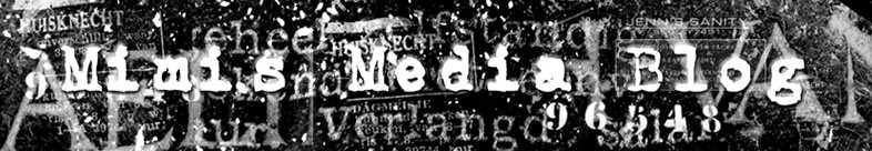
After creating my logo I also had to make a matching banner for my blog. I followed the same theme and 'busy' look. I used the same font and colour for the text, only when I typed it it did not appear clearly as part of the background was also white. To make the text clearer to read, I gave it a shadow and 3D effect so that it came out of the page more. It is now easier to read than before.


Logo
For my logo, I decided my theme was going to be grunge simply because I like the style.
To create it, I started an A3 canvas from scratch on Photoshop. I filled the background in black and created a new layer. The colour black also blends in well to the black background of my blog page. Then, instead of using Phoshop's default brushes, I loaded some more interesting downloaded brushes. To do this I went to the 'Brushes' dropdown list, clicked an arrow on the right hand side and uploaded the brushes from where they were saved (you can download many fonts on websites such as www.brusheezy.com). I chose the 'grunge' brushes in white as I though this colour would be best on a black background. I decided to have a very busy logo as I thought it looked effective and downloaded a matching font for my name from the Internet.

Signs / Semiotics
 This semiotic is an ICON because it looks like what it represents- this no-smoking sign looks like it is forbidding smoking because of the red line across the cigarette.
 This is a SYMBOL because it needs to be culturally learned. Symbols do not look like what they represent. All punctuation is symbolic as it needs to be culturally learned.
 Smoke is an INDEX because it is suggestive and connected to what it represents e.g. smoke implies fire, gold implies wealth etc. Most body language is indexical.
Subscribe to:
Posts (Atom)
