Friday 24 April 2009

Evaluation Video


Mimi Yagoub Media Studies Evaluation from St Marylebone Media Studies on Vimeo.

Double Page Spread - Final Draft with Improvements


To improve my Double Page Spread I needed to make the text smaller- from 16pt, which would have been unusual for a magazine, to 11pt. To do this meant I had to add more text, so I added more questions and answers.

Contents Page - Final Draft with Improvements


To improve the final draft of my contents page I decided to add shadows to all the numbers- white for the red text and red for the white text. This made the numbers stand out more against the dark background. I also remembered to add a page number in the bottom right hand corner.

Front Cover - Final Draft with Improvements


For my final draft I realised that I had not included the price on my front cover, so I did this twice- at the bottom and at the top of the page, because I had seen this done in other magazines. I also changed the position of my barcode to make the layout of the page more conventional. To do this I had to edit the text and make the 'AND' an '&'.

Saturday 28 March 2009

'Fuse' Music Magazine Animoto

http://animoto.com/play/TBL47FBHXYhbAX5gNWBr2g?autostart=true

Friday 27 March 2009

Double Page Spread - Final Draft


I made a few slight changes to my first draft to produce the final draft for my double page spread. I removed the page number '13' from the left page because I felt that it was not necessary and it did not look very good. I also shifted the text upwards on my article so that the first 4 lines wrapped around the drop cap. I did this because it is conventional for most magazines. I then had to add a bit of text because the top and bottom margins were too big and made the page look less professional.
I also felt that the by-line ('Article by Mimi Yagoub') did not look at the bottom of the article as this was an unusual place to put it on a typical double page spread. I therefore put it with the AP (Associated Press). I also changed the photo credit to Mimi Yagoub because I took the pictures, not 'Getty Pictures'.

Contents Page - Final Draft


I completely changed the background for my final contents page draft. I felt that the old background did not match the general theme created by the front cover and double page spread. It looked a bit more like a country music magazine than pop because of the classic guitar and clothing on my model. I therefore took a picture of my artist 'COCO' and edited it on Adobe Photoshop 'Filters' and gave it an 'Ink Outline' effect. I aimed to create this effect because it gave the image a neon, multicoloured glow. I felt that this reflected the pop genre very well. I had to adapt the rest of the page to the new, darker background by making the previously black text white and putting a semi-transparent black square shape behind each text box so that the text was clearly visible. I also gave the 'CONTENTS' title a 3D effect by duplicating the layer, changing the second text's colour to black and shifting it behind the first layer. This made the letters stand out more against the white outline created by the 'Ink Outline' effect. I also gave the guitar and radio pictures a simple white glow and the CD picture a thin pink outline so that the images stood out against the dark background a bit more.
I feel that my contents page is effective as it now links in more to my pop / pop rock genre because of the funkier background, many colours and electric guitar prop in the background image. The artists featured (e.g. Katie Perry) along with the content advertised in the coverlines will appeal to my target audience because they are for, and relate to, young people.

Front Cover - Final Draft


This is the final draft for my music magazine's front cover. I have not changed anything from my second draft. I experimented with 3D shades for my main coverline by duplicating the layer, making the second one light blue and shifting it behind the text. However, I felt that this did not look very good and stuck with the initial draft. I think that my front cover is effective because it conforms to most magazine conventions, for example by putting the masthead at the top of the page or by having a button. It also reflects the content of the magazine because the colourfulness is quite symbolic of the pop genre and the language used is informal. The language, along with the editorial content shown in the coverlines, also appeals to the target audience: a male / female teenager / young adult (around 15-25 yrs old) interested in pop / pop rock.

Friday 20 March 2009

Double Page Spread


My final Double Page Spread is the top one. I was stuck on whether to choose the first or the second draft because I liked them both, but I thought that in the second one the pink box covered up too much of the photo and made the guitar almost invisible. The only down side to my first draftis that I could not include the explanatory text as it diverted too much attention, so I had to go against what I wrote in the mock up.
I am happy with how my spread turned out. I think that I managed to create a Z-line to aid eye-flow- from the pull quote to the second picture to the title to the exit / box. I also think that my spread conforms to music magazine conventions. It has most of the components I noticed in other magazines inlcuding the smaller details such as the drop-cap, AP and a text box.
I made my double page spread very colourful (like the slug) to match the personality of my artist and the general mood of my magazine. The questions in the interview are bold and a different colour from the text so that the difference between the two is more obvious.
The language I used was very informal and the mood was quite colloquial (e.g. "Oh gosh"). I also included references to drugs and sex. I wanted to use this kind of language because the magazine is aimed at young adults / teenagers, so the mood should not be to serious / formal.
The pull quoted I used has the word 'stoned' in it in bold. I chose this quote because 'stoned' will attract attention as it is commonly used amongst the target audience and is quite a rebellious word, and I made it bold so that it stands out even more.
The font I used for the block of text is 'Bell MT' because it is serif and this is the best type of font for large blocks of text. The title is in 'SF Old Republic' because this is sans-serif, good for headings, and it is the same font I used for her name on the front cover, showing consistency. I also created consistency by using my house colours throughout the spread, rarely using any other colours.
I made the title black with a pink outline using 'Stroke (Outline) Selection' because I thought this made it stand out the most. I tried making it bright pink like on the front cover, but this was too bright on the spread and did not stand out enough against the background because it was not dark enough.

Double Page Spread Photoshoot


Monday 9 March 2009

Mood Board


This moodboard was a combination of the first ideas that came into my head when I thought of music magazines. It is the mood I will aim to create in my own magazine, and the genres presented are the ones I want to centre my magazine around. The colours and images should help me when planning things throughout the project. I used some technicolour images on the mood board because I want my magazine to be very colourful to represent the pop genre (which will be more dominant in my magazine). On the mood board the pop genre is represented as bold, bright and loud through the multicoloured, big font used for the word 'POP'. To represent the rock genre I included some grunge images, a guitar and a skull and cross bones as these are all associated with rock. However, I do not want my magazine to focus too much on hard rock- I would prefer its style to be more similar to pop so that there is not a very big contrast between the two. For this reason I added the text 'ROCK' in bright lights as this makes it more pop rock and less dark as a genre.

Front Cover - Second Draft


This is the second draft of my front cover. The few changes I made to the original are that I made all the text the same shades of either blue (which I colour picked from the model's t-shirt), pink or purple (my house colours) as this looked more professional. I also made the date line up with the masthead and made the barcode slightly smaller because it is never as big as it was in normal magazines.


In this draft, I experimented with changing the colours of the union jack in the button to my house colours. I felt that this did not work as well as the original colours, so I chose the other option.

Contents Page


I am quite happy with this contents page, as it turned out how I wanted it to. I have made it very colourful to link it directly to the genre of the magazine, which is mostly pop (usually represented quite colourfully- see mood board). I added colour by colour filtering the background to mostly pink and blue, as these are my house colours and they are also quite bright. I also colour filtered the first photo of a radio as this created quite a neon effect on the page.
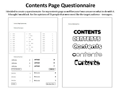
Most of the layout / font was decided by the results I got from the questionnaire I carried out. I feel that the masthead font works well- the transparency makes the colour come through and it is big and bold like the music in my magazine is.

I chose to take photos of things that related directly to the content described in the text. For example, I accompanied the article 'Katy Perry gives us some guitar lessons...' with the photo of a classic guitar. I chose to use a photo of a guitar taken at a low camera angle as this filled the empty space on the page more and made the page look more interesting.

I made parts of the text red when they belonged to articles featured on the front cover. I did this because it is conventional for a magazine and it makes it easier for the reader to read the magazine, making it more appealing.

If I was to improve my contents page I would shift the top photo and block of text more to the right as they look slightly cramped, and also if the page was on the right hand side in a magazine the photo would be too close to the central fold and quite a lot of it would not be visible.

Contents Page Mockup

Friday 27 February 2009

Contents Page Photoshoot

These are the photos I liked best from my photoshoot:

1. Radio / Hi-Fi


After I'd 'smart fixed' both photos on photoshop and changed the brightness + contrast, I decided that the first photo (without flash) looked better, so I lassoed out the background and colour filtered it to light blue:


2. Many CDs


Out of these two photos I chose the first one as it came out less blurry than the other one. I also 'smart fixed' this photo to make it even less blurry, and I adjusted the brightness + contrast because without flash it appeared a bit too dark:

3. Classic Guitar


Even though in the planning for the photoshoot I said that I would not use flash for this photo, I found that there was not enough natural lighting to make the image look bright enough. I also decided to experiment with different angles as I thought that this would make the contents page look more interesting. In the end I thought that the second picture looked best on the page as it also filled more space, so I used the 'Magnetic Lasso Tool' to get rid of the background:

Contents Page Photoshoot Plan


Friday 13 February 2009

Front Cover


I decided that the house colours for my magazine would be purple, pink and blue after carrying out my questionnaire. I therefore mostly used these colours when creating my front cover. With my cover lines, I made the kickers a different colour from the explanatory text because I had seen this done in other magazines. It also made the page more colourful, which related to the genre of 'FUSE' which is mostly pop. Pop is usually associated with multicolour / technicolour (see Mood Board). I feel that the masthead font links in well to modern music theme, so I kept it for the sell line and date because they were close to the masthead.
I managed to give the button the pattern of the union jack using Adobe Photoshop. I feel that the colours of the flag provide a bright, eye-catching contrast to the other colours used on the page.
I also used Photoshop to make the model in the picture's head come over the masthead. I used this technique because many popular magazines do it because they are already so well known that they are recognisable even if part of their masthead is hidden. I wanted this idea to be created on my front page.
I rotated the barcode and put it on the side of the page so that it would not fill up the space needed for my cover lines and so that the right hand side of the page would not be too empty.
In my cover lines I included buzz words such as 'EXCLUSIVE' and 'WIN!' to attract the reader. I also used the words 'SEX, DRUGS AND ROCK n ROLL' in my main coverline because this kind of language will appeal to my target audience- young adults.
I made some slight changes to my mock up. Instead of putting the date underneath the sell line I decided to put it on top of the masthead as I felt this took up less space.
However, all the coverlines are positioned as explained in the mock up. I placed the main coverline in the bottom right corner because I thought it looked good there and I saw this done frequently in other magazines such as 'Marie Claire':


Front Cover Photoshoot


Front Cover Photoshoot Plan


Double Page Spread Presentation