Friday 28 November 2008

Black and White Areas on Image

With Photoshop you can also edit an image so that only part of it appears in black and white, while the rest is still in colour. This is useful for advertising campaigns, as it can be used to highlight a certain part of the picture to make the advert more powerful.

To do this you first have to create a ‘Hue/ Saturation’ adjustment layer.


You then bring the saturation down to -100 and make the Hue/Saturation layer invisible.

The Colour Replacement Tool is then selected and the colour is set to black. Then the selected areas can be filled in.


This photo was taken for an article for a school prospectus on falling standards of British schools. We decided to focus on theft. I made all of the image black and white except the hand which is stealing the phone to put the main focus on the theft. I then added text to fit the picture.

Monday 10 November 2008

Colour Filtering

Colour filtering is when you give a certain colour/ colours to an image. This gives it a special effect and makes it interesting to look at. It is good for advertising because you can give the image the company’s colours.
My task
was to add a colour filter and text to this photo and turn it into an advert for a TV programme.

To add a colour filter, first you have to duplicate the background layer.

Then you add a hue and saturation layer and bring the Hue/Saturation and Lightness down to around -70.

Then you create a new layer and change the style to ‘soft light’ ('soft light' is an example of a colouring effect. There are many more to choose from on Photoshop) using the drop down list just above the new layer icon.

Using a normal, solid, big sized brush (around 200px), colour over the background in the style and colour you want.


Finally, you need to add a Gaussian Blur to make the colours fade into the picture more. To do this you go to the drop down list Filter--Blur-- Gaussian Blur. Bring this to around 80-90 pixels.

Font Styles


(Used for fun texts and cards as it doesn’t look serious and is bold and different)

(This is used for large blocks of text as it is easy to read quickly and is very neutral in style)

(This is used for headlines as it is the clearest font type and easy to read even from afar)

(This font type can look elegant and demonstrate class)

It is important to choose carefully what type of font you use in media texts, especially on front covers. This is because the front cover will be the first impression a person gets of the magazine. The masthead must use a clear, bold font (sans-serif) and the text must be easy to read (either serif or sans-serif). For large blocks of text, serif is the best font because it is the easiest to read quickly and easily. The style is neutral so is suitable for almost any text.
The decorative font often resembles things or objects, and so is not neutral. It looks informal and bold so is used for fun things such as birthday cards.

The script-style font looks elegant and handwritten, demonstrating class. It is used for formal texts which require style, such as wedding invitations.
When searching for original fonts to use in my work, like for my front page, I download them from the Internet on sites such as www.1001freefonts.com and save them into the Local Disk (C:/drive).

Cloning

Cloning is when you erase things in a picture you do not want by taking similar looking sections and laying them on top of the area you do not want. It is useful when removing unwanted objects when publishing pictures and you can remove copyright things such as logos which would not be allowed.

F
irstly, the 'clone stamp tool' is selected.


Then, holding down the ALT button, the point which will be used in the cloning is selected. The area is then covered up with the mouse button.


It is useful to use the ‘blur’ tool afterwards to help the cloned area blend in more.

BEFORE

I need to remove brand names because they would not be allowed in a professional picture and unwanted people so as to not divert the attention from the main image which needs to focus on students because the photos is for the school prospectus.


AFTER
By using the clone stamp tool on Adobe Photoshop Elements 4.0 I managed to remove the person standing on the stairs and the brand names ‘Zara’, ‘Just do it’ and ‘Dior’ on three bags.

Mise-en-scène

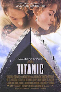
The mise-en-scène of an image is everything shown in it- costumes, props, lighting, actors/models, special effects and anything else which is "put into the frame". The mise en scène in this advert is two actors hugging, text, a title and a ship. Light hits only half of the ship, so half of it is in darkness. Special effects were used to make the two people appear faded into the sky.

Image Connotation and Denotation


In our lesson we learnt about denotation and connotation. Denotation is simply what is shown in an image, while connotation is the meaning behind the image. The advert denotes a man hugging a woman. The man is dressed simply while the woman is dressed in elegant, expensive clothes and has a diamond earring. Both their faces are sombre and the woman is looking downwards. You can also see the front of a ship taken from a low angle with water splashing at its sides. The title Titanic is written in big capital letters in front of the ship, while all the other text is written in much smaller letters. The heading at the top of the advert says ‘Nothing on earth could come between them’.
The connotation of the two people hugging is that they are in a loving relationship together. The words ‘Nothing on earth could come between them’ also suggest that the two people are deeply in love. This phrase could also mean that since nothing on earth can come between them, but the Titanic is on the sea, it will be the sea that comes between them. The man is dressed simply, which could mean that he’s quite poor, while the classily dressed woman looks a lot richer. The fact that this is quite obvious could mean that their wealth could be an important factor in this film. The diamond earring stands out, also suggesting that some kind of diamond plays a part in the story. The ship in the foreground shows that the ship is central in this story. This is also clear by the fact that the film is named after it, and it could suggest that the setting of the film is on the Titanic.

Intro

This blog is backdated with information and examples on what I have studied in my AS Media Studies course so far.