
(Used for fun texts and cards as it doesn’t look serious and is bold and different)

(This is used for large blocks of text as it is easy to read quickly and is very neutral in style)

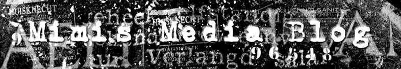
(This is used for headlines as it is the clearest font type and easy to read even from afar)

(This font type can look elegant and demonstrate class)
It is important to choose carefully what type of font you use in media texts, especially on front covers. This is because the front cover will be the first impression a person gets of the magazine. The masthead must use a clear, bold font (sans-serif) and the text must be easy to read (either serif or sans-serif). For large blocks of text, serif is the best font because it is the easiest to read quickly and easily. The style is neutral so is suitable for almost any text.
The decorative font often resembles things or objects, and so is not neutral. It looks informal and bold so is used for fun things such as birthday cards.
The script-style font looks elegant and handwritten, demonstrating class. It is used for formal texts which require style, such as wedding invitations.
When searching for original fonts to use in my work, like for my front page, I download them from the Internet on sites such as www.1001freefonts.com and save them into the Local Disk (C:/drive).

No comments:
Post a Comment