skip to main |
skip to sidebar
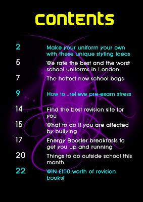 For my contents page I chose a very simple design. I did not use any other contents page for ideas as I wanted my one to be original and different. I chose a black background as I find this more elegant and less boring than white, and loaded the brushes Photoshop. I thought that it would be interesting to have just one shape in the middle of the page. The shape I chose creates a slightly mystical feel, which to makes it even more appealing. I felt that purple looked good on the black background, and I also chose it because it is one of the theme colours of my magazine. I used the other theme colours blue and yellow for my text. I highlighted the cover stories in blue because I saw other magazines do it and thought it made it easier for the reader to find their desired story. I chose those particular fonts for the title and subtitles because they looked slightly sci-fi and so matched the general feel of the page.
 This is the finished front cover for my school magazine. I think that it is quite successful as it is colourful and looks quite professional. I used Adobe Photoshop to create it as it had so many tools and effects I could use to make the front cover look as professional as possible. For example, it let me clone out some unwanted cables in the background to make the main image look better.I chose this font for the masthead as it looked original and was therefore a unique typeface to distinguish my magazine from others. I chose the name 'fly' because it can imply aspirations and aiming high, the ideals of the student core buyer.I only used 3 different colours on my front cover, excluding black, to not make it too busy and to create 'theme colours' which will be the base colour running throughout my whole magazine.I positioned the cover lines on the sides of the page as best as I could so as to not completely cover my model.