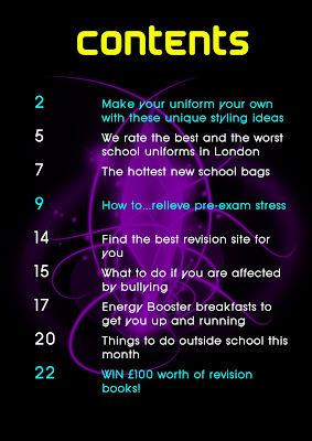
For my contents page I chose a very simple design. I did not use any other contents page for ideas as I wanted my one to be original and different. I chose a black background as I find this more elegant and less boring than white, and loaded the brushes Photoshop. I thought that it would be interesting to have just one shape in the middle of the page. The shape I chose creates a slightly mystical feel, which to makes it even more appealing. I felt that purple looked good on the black background, and I also chose it because it is one of the theme colours of my magazine. I used the other theme colours blue and yellow for my text. I highlighted the cover stories in blue because I saw other magazines do it and thought it made it easier for the reader to find their desired story. I chose those particular fonts for the title and subtitles because they looked slightly sci-fi and so matched the general feel of the page.


 The Colour Replacement Tool is then selected and the colour is set to black. Then the selected areas can be filled in.


